Designs that «must keep their shape when the content changes», like app screens and web mockups, are easier when built with frames and auto layout. When a button's label gets longer, the button grows on its own, and when the screen width changes, elements follow the rules you set. Setting it up takes a little time at first, but the more often a design changes, the more that time pays back.
Making frames
A frame is a small box you put inside an artboard. Making units such as buttons, cards and list rows into frames lets you handle their contents as one piece. Press F and drag inside an artboard to create a new frame, or select elements you've drawn and press ⌥⌘G to wrap them in a frame.
Select a frame and the inspector shows Clip off · Clip on. With clipping on, content outside the frame is cut off, which is useful for putting a photo inside a card or imitating a scroll area.
Auto layout
Select a frame and open the Auto layout setup in the inspector to get a large window (you can also turn it on right away with ⇧A). Turn auto layout on at the right and the Frame rules appear; set the values while checking the result in the preview on the left, then click OK. You can also reorder items by dragging them in the preview.
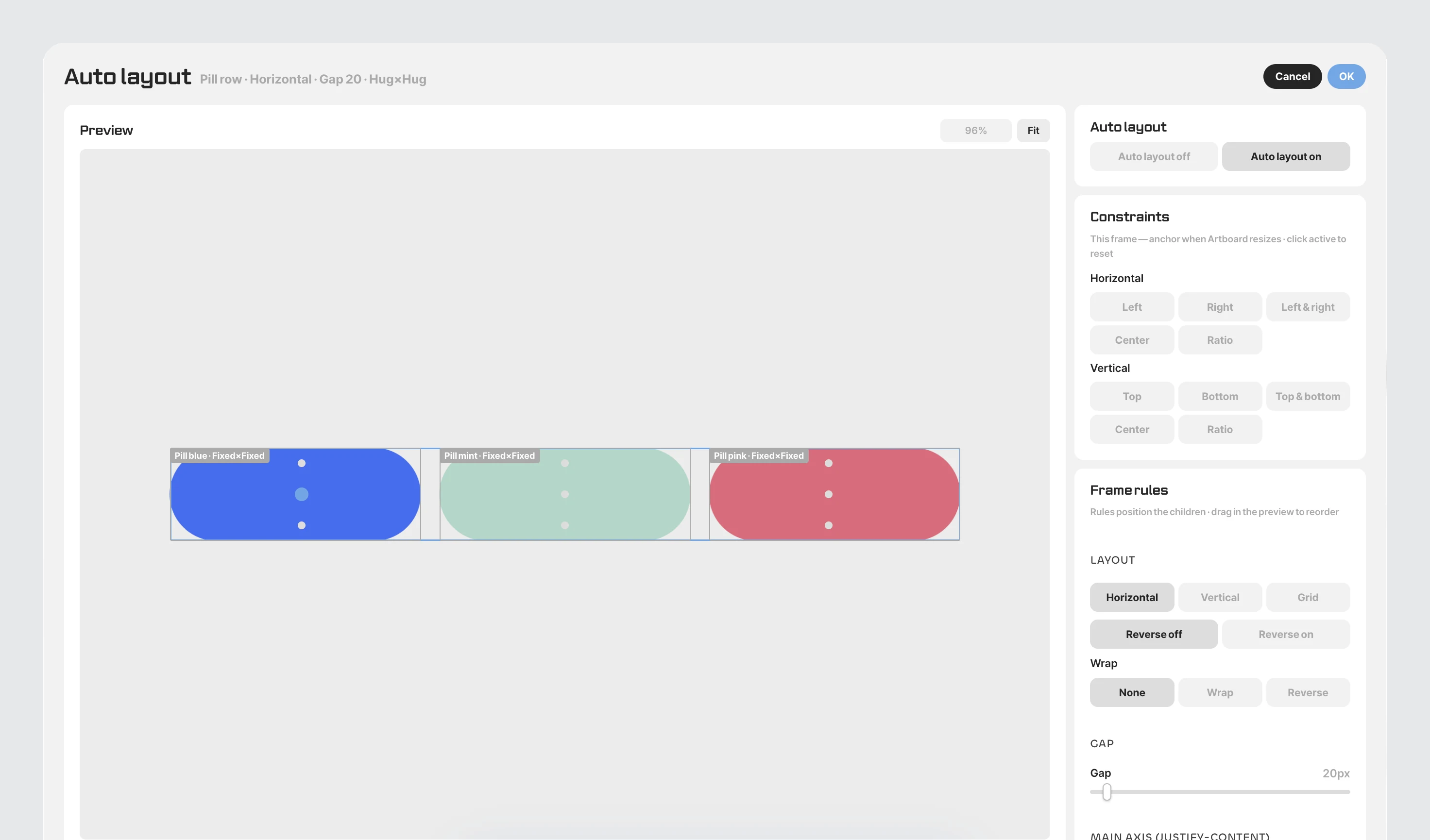
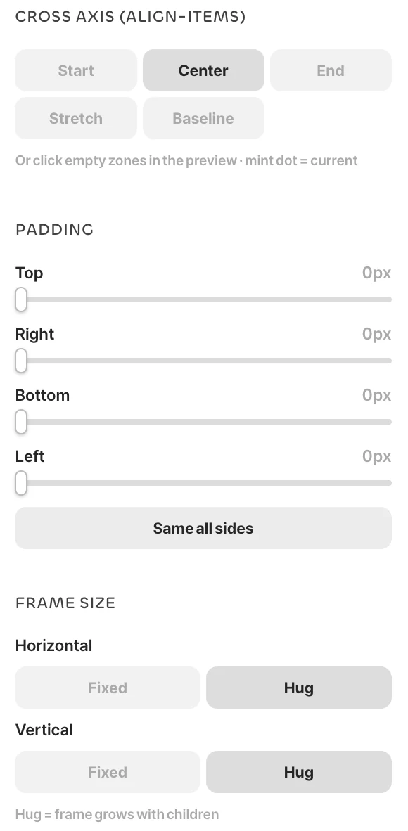
The rules are simpler than they look. In Layout, choose whether to line items up horizontally, stack them vertically or place them in a grid, and decide whether to Wrap when they overflow. Then set the Gap between items and the frame's inner Padding (top, right, bottom and left, or Same all sides), and choose where items gather with Main axis (Start, Center, End, Between, Around, Evenly) and Cross axis (Start, Center, End, Stretch, Baseline). You can also pick alignment by clicking one of the nine zones in the preview, which is often faster than thinking it through in words.
Finally, set the Frame size for width and height to Fixed or Hug. With hug, the frame grows as its contents grow, and you have a button that stretches with its label. To turn auto layout off, choose off in the same window or press ⌥⇧A.
Constraints
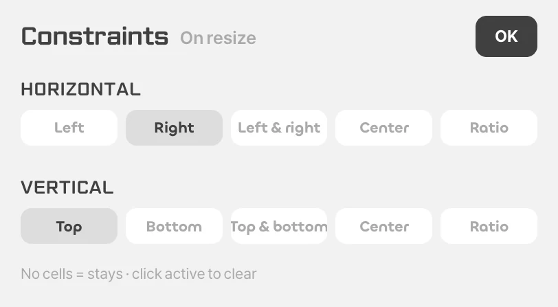
Select an element and open the Constraints setup in the inspector to decide where it sticks when the artboard's size changes. Horizontally choose Left, Right, Left & right, Center or Ratio; vertically Top, Bottom, Top & bottom, Center or Ratio. With nothing turned on, it stays put. For example, set a close button at the top right of a screen to «Right» and «Top», and a full-width top bar to «Left & right», and they keep their place when the screen width changes. Elements inside a frame can also be set in the Constraints section of the auto layout window.
Layout grids
Select an artboard or frame and click Layout grid + in the inspector to lay down a grid, columns or rows. Set the count, gutter, margin and color, and aligning elements to the grid becomes easy. Show or hide it with ⌃G (Ctrl⇧4 on Windows). Place mobile, tablet and desktop screens side by side as separate artboards and match them to the same grid for a clean responsive mockup.