What is a component?
A component turns an element you reuse in many places, like a button, icon or card, into a single original. When you change the original, every copy (instance) made from it follows, so you don't have to visit ten screens to change one button color. It helps most in app mockups with many screens and designs with repeated parts.
Making and using them
Select a frame and press ⌥⌘K, or right-click the frame and create one from the Component group. Create instances from the same group and place them where needed; when you change the original, the instances change too. To change just one place separately, select that instance and detach it with ⌥⌘B so it no longer follows the original. Detaching can't be relinked except by undoing, so make sure the element really needs to be managed separately first. Versions that differ in size or state (default, pressed, disabled and so on) can be grouped as variants and managed in one place.
The component assets window
Click Open assets in the Components section on the right to open a large window. My assets on the right gathers the components you've made, including ones from other projects, so you can use the same parts across projects. Versions like v1 and v2 are added as you edit.
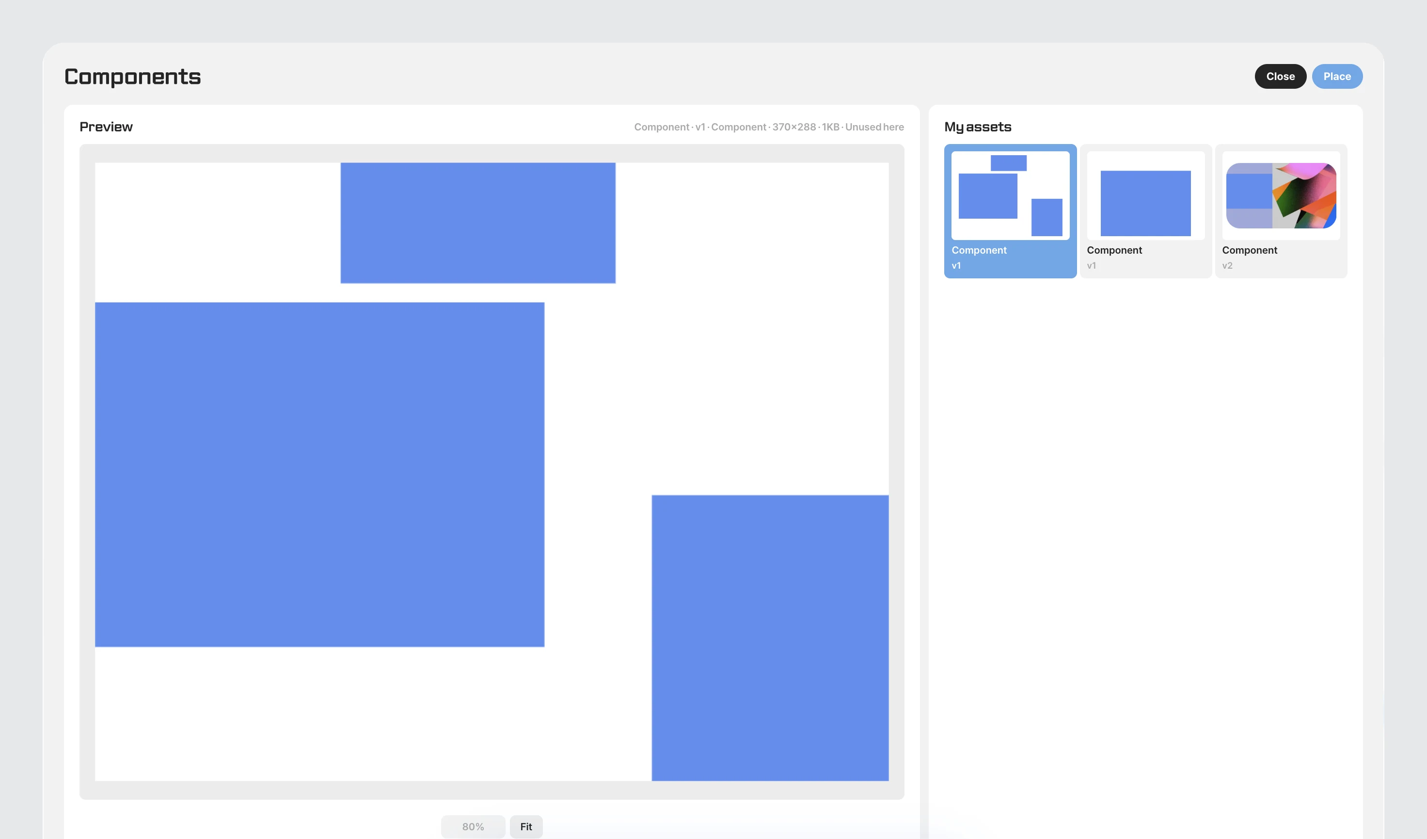
Select an asset and the preview on the left shows its size, file size and whether it's used in the current file. Click Place at the top right to put it on the current artboard, and Close to close the window.
Growing into a design system
Use components together with fill styles, paragraph styles and vector styles and color variables with light and dark values, and you can manage your brand's colors, type and component rules as one design system inside this app (see «Styles»). We recommend starting with one button and one card as components and adding more little by little. For images to hand to developers, save export settings on each layer and export them all with a single ⇧⌘E (see «Exporting»).