




When you first start designing, color is what you agonize over longest. You pick colors you like one at a time and stack them up, but the whole thing looks scattered somehow, while other people's work looks tidy with just a few colors. The same shapes and the same type can give a design a completely different impression through color combination alone, so palettes tend to feel like a matter of instinct.
But well-organized palettes mostly follow principles that repeat. Use fewer colors, give each color a role, and let differences in lightness create the order in which things get read. Once you know these principles, you can stop hunting for “pretty colors” and start choosing “the right color for this spot.” And if you also have a way to apply the colors you've settled on across the whole design without drift, the consistency holds even as the project grows.
In this article, we look at the basic principles for building a palette, and how to manage the colors you've chosen in a design tool.
1.The three properties of color — what hue, lightness, and saturation each change.
2.Palettes by role — the main, secondary, and accent colors, and the 60:30:10 ratio.
3.Lightness contrast — why a color can be pretty and still unreadable.
4.A practical order for choosing colors — how to grow a palette from one brand color.
5.Color styles and color variables — how to use chosen colors consistently across a whole design.
Color Is Made of Three Properties
The reason choosing colors feels so daunting is that you see a color as one lump. Color can be broken into three properties. Hue is the kind of color, such as red, blue, or green. Lightness is how bright it is, and saturation is how vivid it is.
Once you separate these three, palette problems become much more concrete. The worry that “the colors look tacky” usually means several highly saturated colors are mixed together. The worry that “the text is hard to read” usually means the text and background have similar lightness. And the feeling that “the mood is cold” is often because the hues are clustered on the blue side. If you can pinpoint the problem by property, you can fix it by adjusting just that one property, without replacing the colors wholesale.
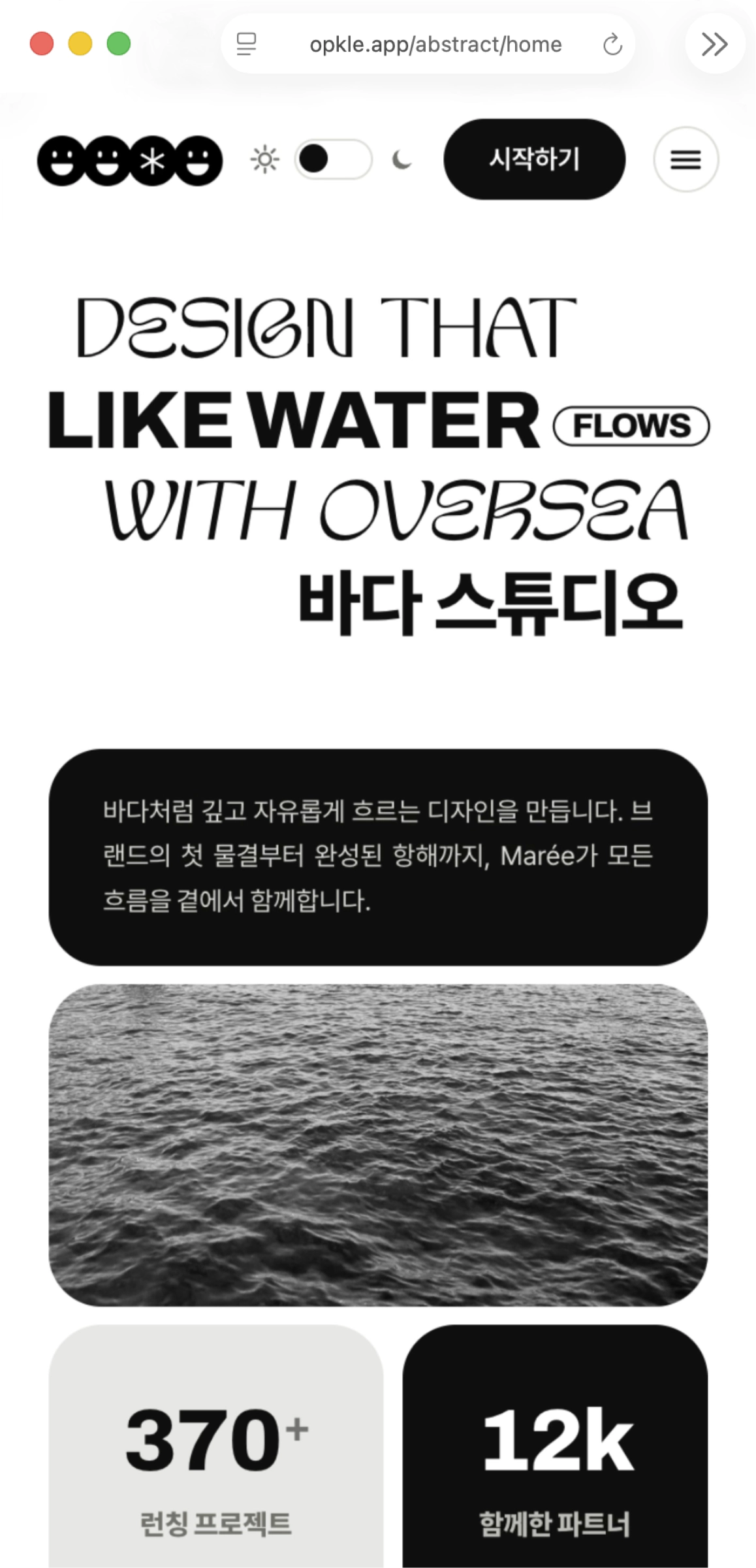
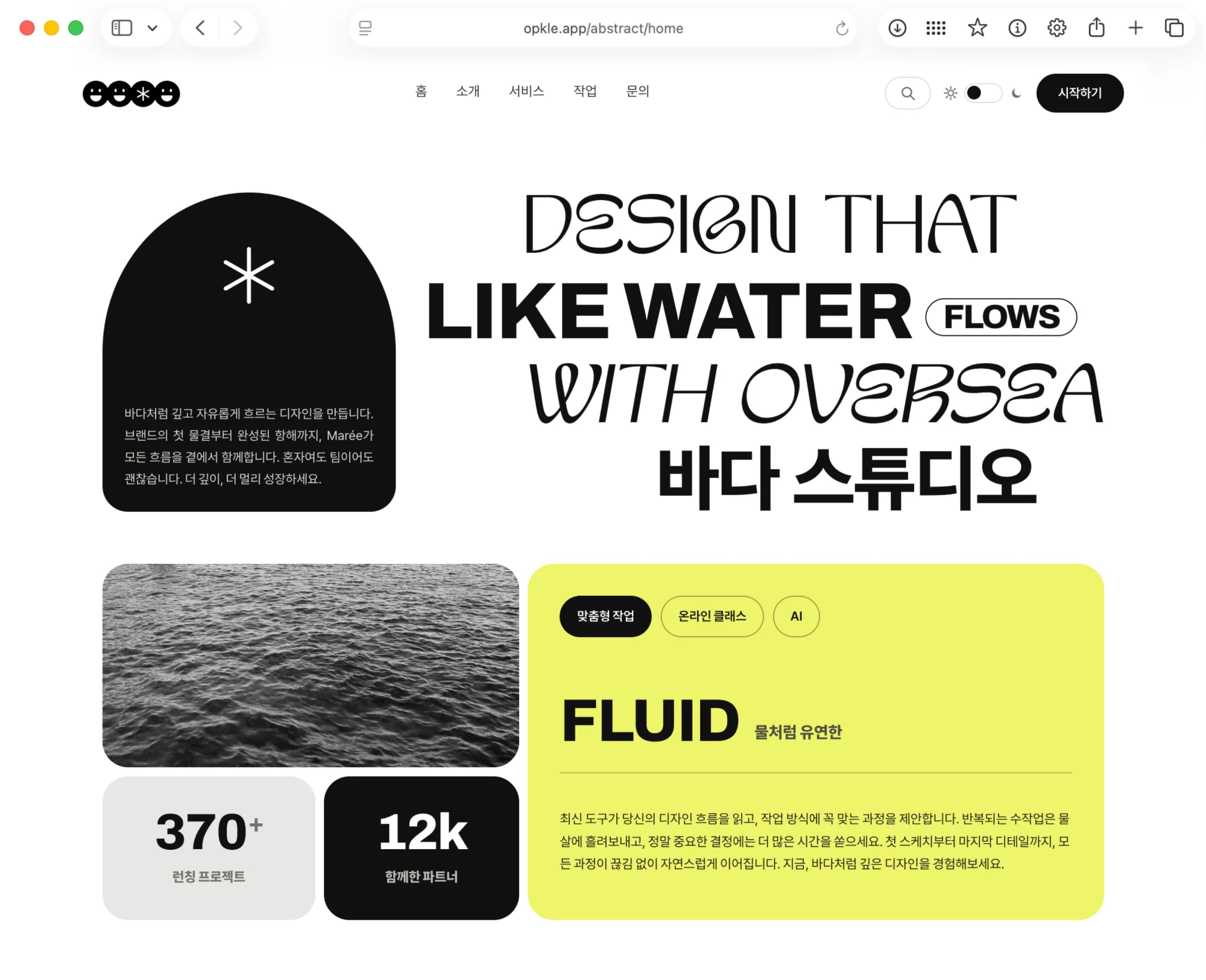
If you look at well-organized designs, you'll often find the hues narrowed to two or three, with several lightness steps of the same hue used instead. A deep navy headline, a mid-tone blue button, and a very pale sky-blue background: change only the lightness within one hue, and even though several colors are used, they read as one mood.
Give Colors Roles — 60:30:10
The most common reason a palette feels scattered is that every color competes with the same weight. An old way to avoid this is to give each color a role.
The three roles of color
The main color is the background color that takes up most of the screen. White, light gray, or a very pale brand color is usually used, taking up about 60%.
The secondary color shows the character of the design, in headlines, large blocks, and bands over photos, and takes up about 30%.
The accent color is a signal that says “look here.” Use it only on buttons, prices, and important numbers, and save it at about 10%.
60:30:10 is less a formula to follow exactly than a guide to give each color a different weight. The key is to save the accent color. If the accent shows up everywhere, it stops being an accent, and the whole screen seems to shout. But if the accent appears on just one button, the viewer's eye goes to that button naturally.
Pretty but Unreadable Is a Failure — Lightness Contrast
If you like a color combination but the text isn't easy to read, that palette has failed. What decides readability is not hue but the difference in lightness. Even if the hues are completely different, like green text on a red background, similar lightness makes the text look blurry and run together, and switched to black and white, the text nearly disappears.
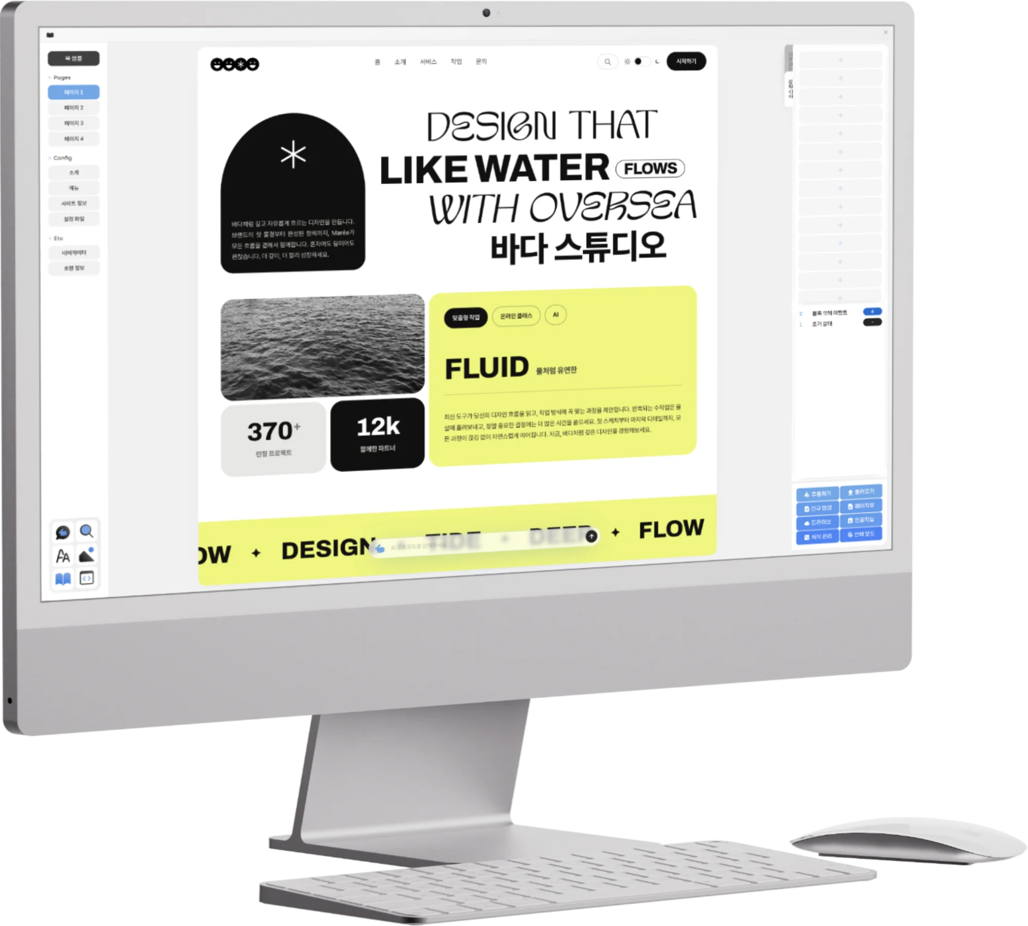
There's a simple way to check: turn the design black and white. In Opkle Editor, select an element and pull saturation all the way down in the filter section on the right, or if it's a photo, click the black-and-white button. If the headline, body text, and buttons still stand apart clearly in black and white, the lightness contrast is sufficient. When you've finished checking, undo with ⌘Z.
The Web Content Accessibility Guidelines (WCAG) recommend a lightness contrast of at least 4.5:1 for regular text. You don't need to measure numbers for every design, but it's worth a second look whenever you're tempted to put light gray text on a white background. The smaller the text, and the brighter the place it's viewed, like a phone screen, the more contrast it needs.
Grow a Palette From One Brand Color
Trying to pick several colors from scratch is daunting. It's easier to settle on one base color first and expand from there. If your logo or brand already uses a color, that color is the starting point.
The order for expanding a palette
Change the base color's lightness to make two dark steps and two or three light steps. Use the dark ones for headlines and text, and the light ones for backgrounds and cards.
Instead of picking a gray separately, use a gray with just a touch of the base color mixed in. It blends into the overall mood far more naturally than a pure gray.
Choose just one accent color, either the opposite hue of the base color or a more saturated version of the same family.
If you need colors with fixed meanings, like success, warning, and error, match green, orange, and red to the same saturation level as the base color.
Borrowing colors from a photo or poster you like is also a good method. In Opkle Editor, click anywhere on the screen with the picker (I) and that color becomes the fill of the selected element, so you can place a reference image on one side of the canvas and pull out colors one by one to build a palette. Even then, rather than using them as they are, matching the saturation of the picked colors to a similar level makes the result look far more orderly.
Store Chosen Colors as Styles
Even if you chose your colors well, as a project drags on, blues that are similar but slightly different tend to creep in here and there. The way to prevent this is to store the chosen colors as styles and draw from them only.
In Opkle Editor, click the ⁘ button on the Fill section's title row to open the fill style panel. Click an empty slot and the current color is saved as a new style; select another element and click a chip, and that color is applied. When you change a chip's color, the color of every element using that chip changes with it, so when you want to tweak a brand color slightly, you can fix the whole design at once. The color chips in the inspector's style settings are a 72-slot color style panel, which suits gathering a whole palette in one place.
If you're working on an app screen that needs dark mode, try color variables. When you connect a chip to a color variable, it holds two values, light and dark, and by choosing light or dark per artboard you can view the bright and dark versions of the same design side by side. If you want to tidy up colors already painted here and there, find “Select — Same Fill” in Quick Actions (⌘/), select every element using the same color at once, and click a style chip to swap them.
Common Color Mistakes and How to Fix Them
When a palette feels off, the cause usually narrows down to a few things. If your design looks uncomfortable somehow, check it against the list below one item at a time.
Common mistakes
Using pure primaries as they are — red, blue, and green at 100% saturation tend to tire the eyes and look cheap. Lowering the saturation a little, or the lightness slightly, makes the same hue far calmer.
Pure black text — fully black text on a white background has too much contrast and looks stiff. A very dark gray, or a dark color with a hint of the brand color, softens it.
Several accent colors — with a red button, a yellow badge, and a green icon together, you can't tell what's important. Settle on one accent color and demote the rest to secondary colors or gray.
Background colors that fight the photo — put a highly saturated background next to a colorful photo and both get buried. If the photo is the star, let the background step back to white or light gray.
When you need to put text over a photo and the photo's colors make the text hard to read, try laying one translucent dark layer over the photo. In Opkle Editor you can stack several fills on a single shape and set the layer's density in the opacity field, so you can keep the photo's mood and make the text clear without creating a separate layer.
A Palette Starts With Reducing
A good palette is more about taking away than adding. Narrow the hues to two or three, build steps with lightness, and use the accent color in just one truly important place. Then check that it still reads in black and white. Following just these four things makes most designs far calmer and clearer.
A sense for color isn't something you're born with; it builds up. If you get into the habit of counting, whenever you see a design you like, how many colors it uses, which color covers the most area, and where the accent color sits, before long you'll be able to create the same order in your own designs.
Key Takeaways
Breaking color into hue, lightness, and saturation shows concretely what needs fixing.
Divide roles among the main, secondary, and accent colors, and save the accent at about 10%.
Lightness difference decides readability. Check that things still stand apart in black and white.
Build lightness steps from one base color, and expand the palette with a gray tinted by the base color and one accent color.
Store chosen colors as fill styles, color chips, and color variables, and the whole design changes together when you edit them.
© Abstract Cloud. All Rights Reserved.
+82 10-2747-3403
are copyrighted by Opkle.