



Type takes up more of a design than you might think. The title on a poster, the sentences on card news, the button labels on an app screen, the descriptions on a product detail page: most designs are, in the end, about making text readable. Yet people often spend ages on photos and colors while leaving the type in the default font. If a design looks somehow amateur, the cause is surprisingly often the type rather than the color.
Typography doesn't end with choosing a font. How many fonts to use, how many size steps to have, how much space to leave between lines and between letters, and how long to make a line all change the reading experience. The welcome news is that these decisions have fairly clear standards. Once you know them, polishing just the type lifts a design a notch in orderliness.
In this article, we go through the basics of handling type in design work, in order.
1.Choosing fonts — Myeongjo (serif) and Gothic (sans-serif), and how many to mix.
2.Type hierarchy — how to create a reading order with size and weight.
3.Line spacing, letter spacing, and line length — the spacing that makes Korean comfortable to read.
4.Handling type in practice — how to use text boxes and paragraph styles in a design tool.
5.Outlines and font licenses — what to take care of before handing off.
Two Fonts Are Enough
Korean fonts fall broadly into Myeongjo (serif) and Gothic (sans-serif). Myeongjo has strokes that vary in strength, a legacy of brush calligraphy, giving a calm, literary impression and reading comfortably in long passages on paper. Gothic has even, clean stroke widths that read crisply on screen and suit conveying information and a modern impression. That's why most screen designs today use Gothic as the default.
The most common mistake beginners make is mixing too many fonts. A handwriting font for the title, Myeongjo for the subtitle, Gothic for the body, yet another bold font for emphasis: each may be pretty on its own, but the whole becomes scattered. Two fonts are enough for most designs, and one is often enough. Just changing the weight (Regular, Medium, Bold) within a single font family can create a hierarchy easily.
If you use two fonts, they must be clearly different. Mixing two similar Gothics looks like a mistake rather than intended contrast. Dividing the roles feels natural: a characterful font for the title and a plain, easy-to-read Gothic for the body.
Create a Reading Order With Size and Weight
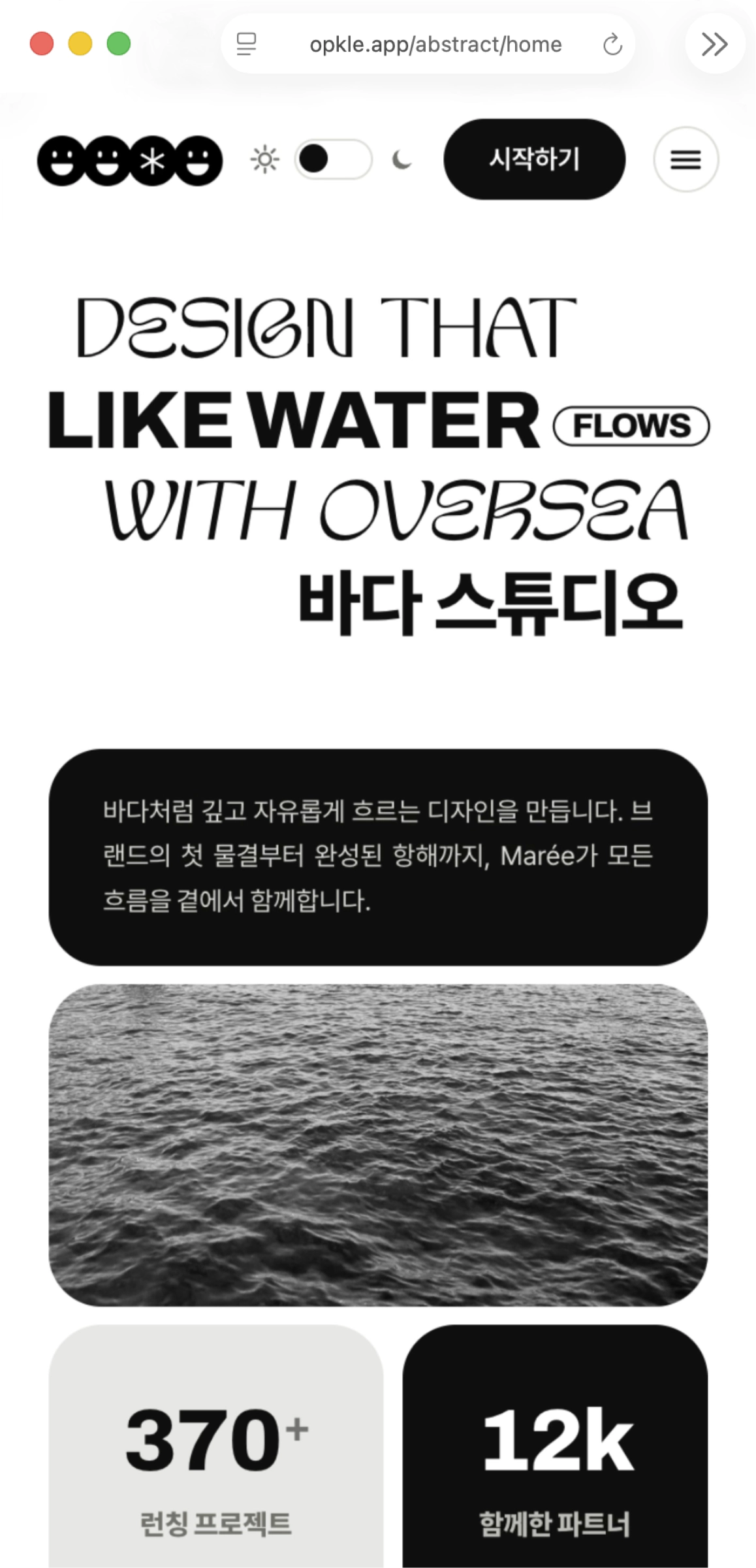
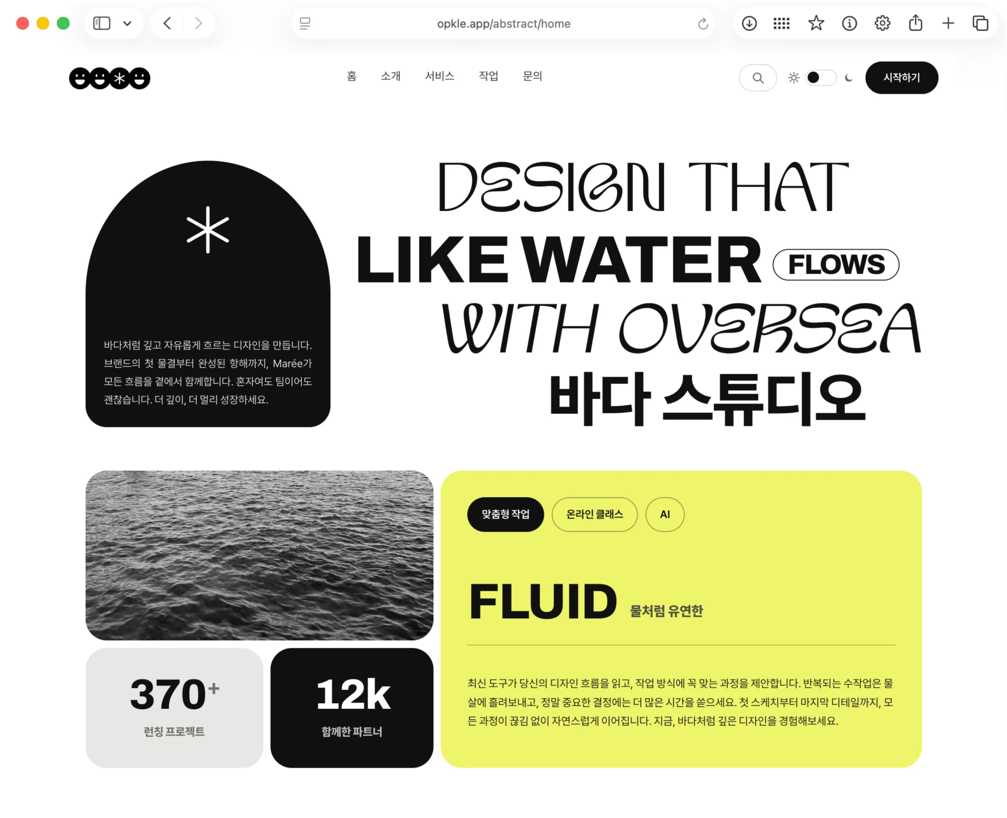
Before reading text from start to finish, people first skim whatever is large and bold. Designing that skimming order is what type hierarchy is. A design with a clear hierarchy tells you what it's about in a few seconds, while one without it leaves you not knowing where to start, so you just pass it by.
Guidelines for building hierarchy
Start with about three levels. Title, subtitle, and body can handle most designs.
Make the size differences between levels clear. If body is 16, a subtitle of 20 to 24 and a title of 32 or more are clearly bigger, so they read as hierarchy.
When size alone isn't enough, add weight and color. Setting body in dark gray and the title in a near-black color with a heavy weight increases the contrast.
Use just one method of emphasis. Using bold, color, and underline all at once isn't emphasis but noise.
Line Spacing, Letter Spacing, and Line Length Decide Comfort
If you've chosen the font and size and the text still looks cramped, suspect the spacing. Hangul is a script of square characters running in dense rows, so reading comfort changes a lot with spacing.
Line spacing is the gap between lines. Body text reads comfortably at about 160 to 170% of the font size, while large, short text like a title should be tightened to about 120 to 130% to look like one block. Give a large title the same line spacing as body text and the gap between lines becomes too wide, so it reads like two separate titles.
Letter spacing is the gap between characters. Large titles look as if they have wider gaps than they really do, so tightening the spacing a little makes them look solid, while small body text suits the default or just a very slight tightening. Conversely, very small text and English capital-letter decoration look crisper with the spacing widened.
Line length matters too. If a line is too long, it's hard to find the start of the next line from the end of the current one, and if it's too short, the eye keeps getting interrupted. For Korean body text, roughly 25 to 40 characters per line is comfortable. Even if the screen is wide, it's better to narrow the text box and keep the line length.
How to Handle Type in a Design Tool
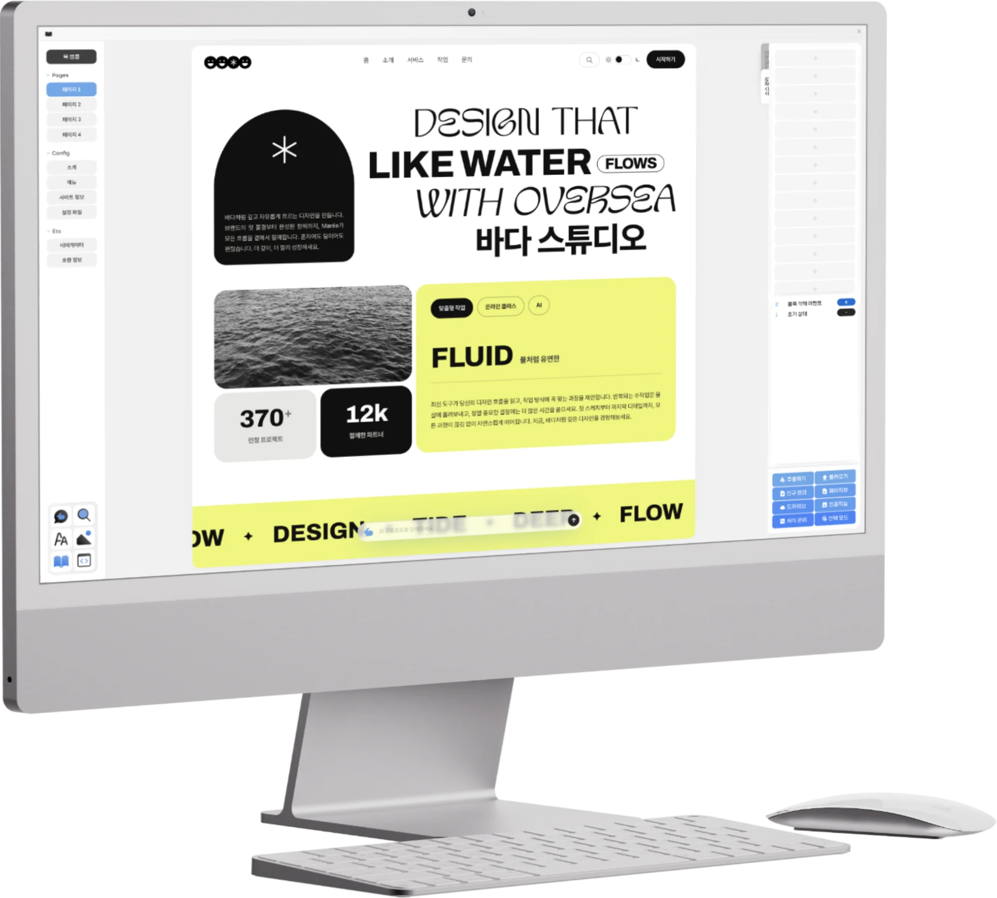
In Opkle Editor, there are three ways to write text. Choose Text (T) and click for a single line, or drag to make a text box. Short text like a title is easy to manage as a single line, and long text like a description as a text box. If you want text that follows a line, such as logo lettering that runs around a circle, choose Text on Path and click a path or shape.
Select text and set the font, size, weight, and color in the Text section on the right, and below it, in the Paragraph section, set line spacing, letter spacing, space above and below paragraphs, and alignment. The text box's sizing mode is also chosen in the Paragraph section; for a text box whose content changes often, leaving it at auto height means the text won't get cut off as it grows. Font files you own (ttf, otf) can be dragged onto the canvas or added through Insert → Font File, and then picked directly from the font list.
Once you've set the hierarchy, store it as paragraph styles. If you make title, subtitle, and body into paragraph styles in the inspector's Style Settings, you only need to pick a style for new text, and when you later want to change the body size, fixing just one style changes the body text across the whole design. For text that needs to stand vertically, right-click and choose Vertical Writing.
Common Type Mistakes
When working with type, there are mistakes everyone makes at least once. Each looks small, but together they make the whole design feel less polished.
Things that make an immediate difference when fixed
Forcibly stretching and squeezing text — Changing the width-to-height ratio of letters to fit a text box makes the font look distorted. Fitting it with size, letter spacing, and line breaks looks far more natural.
Everything is bold — If the title, body, and buttons are all bold, weight no longer emphasizes anything. Save bold for one or two places on the screen.
One lone character left at the end of a line — When a title splits into two lines and only one or two characters remain on the last line, it looks awkward. Set the line break position yourself or change the text box width a little to even out the line lengths.
Text gets lost over a photo — Thin text over a busy photo can't be read. Place the text on a relatively plain area of the photo, lay a color wash, or add a subtle shadow from the Filter section to lift the text.
Text that's too small — Zoomed way in within the design tool, small text looks fine, but it's hard to read in the real output. Get in the habit of shrinking the view to actual size to check while working.
Before You Hand It Off — Outlines and Font Licenses
When you hand a design to someone else or send it to a print shop, the font may not be on their computer. For text that must keep its exact shape, like a logo or a large title, right-click and choose Outline to convert it into shapes (paths), and it will look the same even in an environment without the font. Once converted to outlines you can no longer edit it as text, so it's good to get in the habit of duplicating the original text and hiding it before converting.
Be sure to check the font's usage scope too. Even a free font may allow only personal use, or allow print but not logos or video. For commercial work, it's safer to read the license notes where you downloaded the font first.
Refine the Type and the Design Comes Into Order
Typography is less about eye-catching techniques and more about restraint. Two fonts or fewer, three levels of hierarchy, one method of emphasis, spacing matched to the font size. Following just these few makes the same content read far more crisply and credibly. Next time a design looks off somehow, look at the type again before changing the color.
Key Takeaways
Keep to two fonts or fewer, and building hierarchy by changing weight within one family looks more orderly.
Start hierarchy with three levels of title, subtitle, and body, and make the size differences between levels clear.
Set body line spacing at 160 to 170% of the font size, tighten large titles to 120 to 130%, and keep a line at about 25 to 40 characters.
Use auto height for text boxes and store repeated text looks as paragraph styles to make editing easy.
Before handing off, convert logos and titles to outlines (keeping a duplicate of the original) and check the font license.
© Abstract Cloud. All Rights Reserved.
+82 10-2747-3403
are copyrighted by Opkle.