




The Instagram carousel, a swipeable series of image cards known in Korea as card news, is one of the most commonly made designs today. Shop announcements, course promotions, information roundups, book introductions: a format you flip through image by image keeps people longer than a short post and gets saved and shared more. That also makes it a design you have to produce every week, sometimes every day.
Making card news, you run into two difficulties. One is stopping the thumb on the first card; the other is the labor of repeating nearly ten images in the same style. The first is a matter of structure and design, and the second is a matter of how you work. Both get much lighter once you know the principles and use your tool well.
In this article, we follow one card news piece in order, from planning to export.
1.Size and card count — decide the ratio and how many cards.
2.Story structure — plan the flow from the cover to the last card.
3.Cover design — how to make people stop on the first card.
4.Body card design — how to repeat the same frame so it's easy to read.
5.Cutting repetitive work and exporting — how to ease the weekly labor and export everything at once.
Start With Size and Card Count
On the Instagram feed, the ratio that takes up the most screen is vertical 4:5. At 1080×1350px, it takes up more of the screen than a square, so the chance that a swiping thumb stops goes up. Square 1:1 (1080×1080px) is still widely used, but if you're starting fresh, it's better to make 4:5 your default.
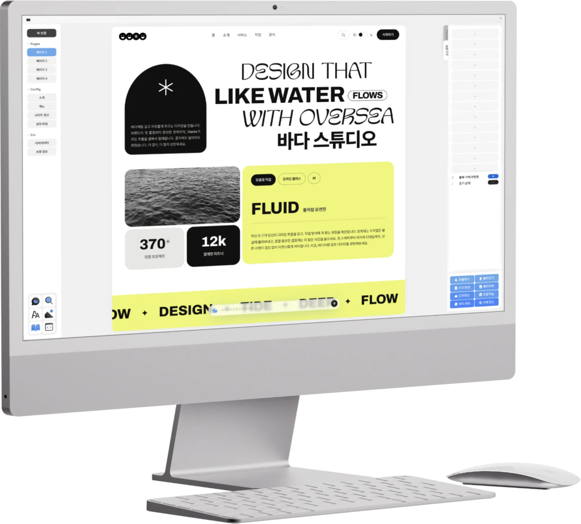
In Opkle Editor, press Crop (C) with nothing selected to enter the mode for setting the artboard size, and you can pick Instagram and mobile ratios like 4:5 straight from the presets. Each preset also shows its actual pixel size, so there's no need to calculate the numbers separately.
Match the card count to what you want to say, but at first, aim for between six and ten cards. Too short and there isn't enough information worth saving; too long and people drop off midway. If you set the rule of one message per card, the count settles naturally.
Plan the Story Structure First
A good card news piece puts structure before design. People read to the end only when there is a continuing reason to swipe to the next card. Before you open the design tool, write out one sentence for each card.
A commonly used flow
Cover — show in one sentence what the story is about and why they should swipe.
Empathy — point to a problem or question the reader has, making it “their story.”
Body — unfold the core content one point per card, numbered in order.
Summary — gather the previous content onto one card so people want to save it.
Last card — state clearly the one action you want, such as follow, save, or visit a link.
The summary card matters more than you might think. People save information they want to see again, and a summary organized on one card gives them a reason to save. On the last card, picking just one desired action, rather than listing several, makes it more likely to lead to real action.
The Cover Must Read Within 3 Seconds
To someone scrolling the feed, the cover is visible for only a second or two. What it's about has to read within that time. That's why the cover's title should be big, short, and specific. A title with a clear number and audience, like “5 Color Mistakes Beginner Designers Make Most,” stops the thumb better than “Design Tips.”
On the cover, cut the word count and raise the size. On a phone screen the card looks much smaller than it really is, so a size that seems fine in the design tool feels small in the feed. If you use a photo as the background, lay a translucent color layer over it so the text reads, and use the accent color on just one key word of the title for the best effect. In Opkle Editor you can stack several fills on a single shape, so you can create the effect of a color layer over a photo without piling up several layers.
Repeat the Same Frame for Body Cards
Unlike the cover, the goal of body cards is to be “easy to read.” If you redesign each card, readers have to find where to look all over again every time. But if the title position, body position, and page number position are the same on every card, readers learn the rule after just two or three cards and can focus on the content alone.
When setting the frame, decide the top-bottom and left-right margins first, then the position and size of the title, body, and page number. Keep body text to three or four lines per card, and when lines run long, it's better to split the card. If you place the brand or account name small in the same spot on every card, the source stays attached even when the images are shared separately.
Cut the Repetitive Work and Export All at Once
Card news repeats the same work every time. In Opkle Editor you work with several artboards side by side on one canvas, so the quickest way is to finish the first body card, then duplicate the artboard and change only the text. As artboards multiply, move to the next and previous artboard with N and ⇧N, and gather all the artboards onto one screen with ⇧1 to check the overall flow.
If you make the header, page number, and account name group that goes on every card into a component, editing the single original changes every card at once. Store the title and body text looks as paragraph styles and the brand colors as fill styles, and next week's card news can draw on the same look as it is. For cards with photos, right-click the photo and choose Canvas Cover to fit it to the artboard with no gaps, and the color tone of several photos can be matched at once with an adjustment style.
When everything is made, choose all artboards in Export at the bottom right and the cards come out bundled into a single zip file. For text-heavy card news, export as PNG rather than JPG so the edges of the letters stay crisp instead of smudged. If you name the artboards in order, like 01 and 02, the files are organized in order too, making them easy to upload.
What to Check Before Posting
Card news is hard to fix once posted, because fixing a single word means deleting the post and uploading it again. Keeping a short checklist to skim before exporting greatly cuts down mistakes.
Pre-posting checklist
Did you view it at phone size? — Shrink the view to the real feed size and check that the cover title reads at a glance.
Any typos? — Text inside images can't be searched or spell-checked. Read each card aloud once.
Are the card order and page numbers right? — When making cards by duplicating artboards, it's easy to move on without fixing the page number.
Is anything getting cut off? — In the feed grid, the top and bottom of a 4:5 card can look slightly cropped, so keep the cover's important text toward the center.
Do you have the rights to the photos and fonts? — Check that no one else's photos or fonts barred from commercial use have slipped in.
The caption is part of the card news too. Putting in the caption the explanations, sources, and related links that didn't fit on the cards helps people who saved it when they return to it later. Restate the core of the cards in one sentence on the first line, so that the caption alone tells what the post is about.
A Carousel Is Completed as a Series
A single card news piece passes quickly, but a series that continues steadily in the same frame becomes the face of an account. If you set the frame, styles, and components carefully when making the first piece, from the second piece on you can focus on the content alone. Few outputs show as well as card news that design isn't something you redo each time, but something you keep up by steadily following rules you set well once.
Key Takeaways
On the Instagram feed, vertical 4:5 (1080×1350px) takes up the most screen; aim for six to ten cards, with one message per card.
Write the flow of cover, empathy, body, summary, one action as sentences before designing.
Make the cover title big, short, and specific, and repeat the same frame on body cards for easy reading.
Cut repetitive work with artboard duplication, components, paragraph styles, and fill styles, and reuse them as they are in the next piece.
Export all artboards at once as a zip, and export text-heavy cards as PNG to keep them crisp.
© Abstract Cloud. All Rights Reserved.
+82 10-2747-3403
are copyrighted by Opkle.