



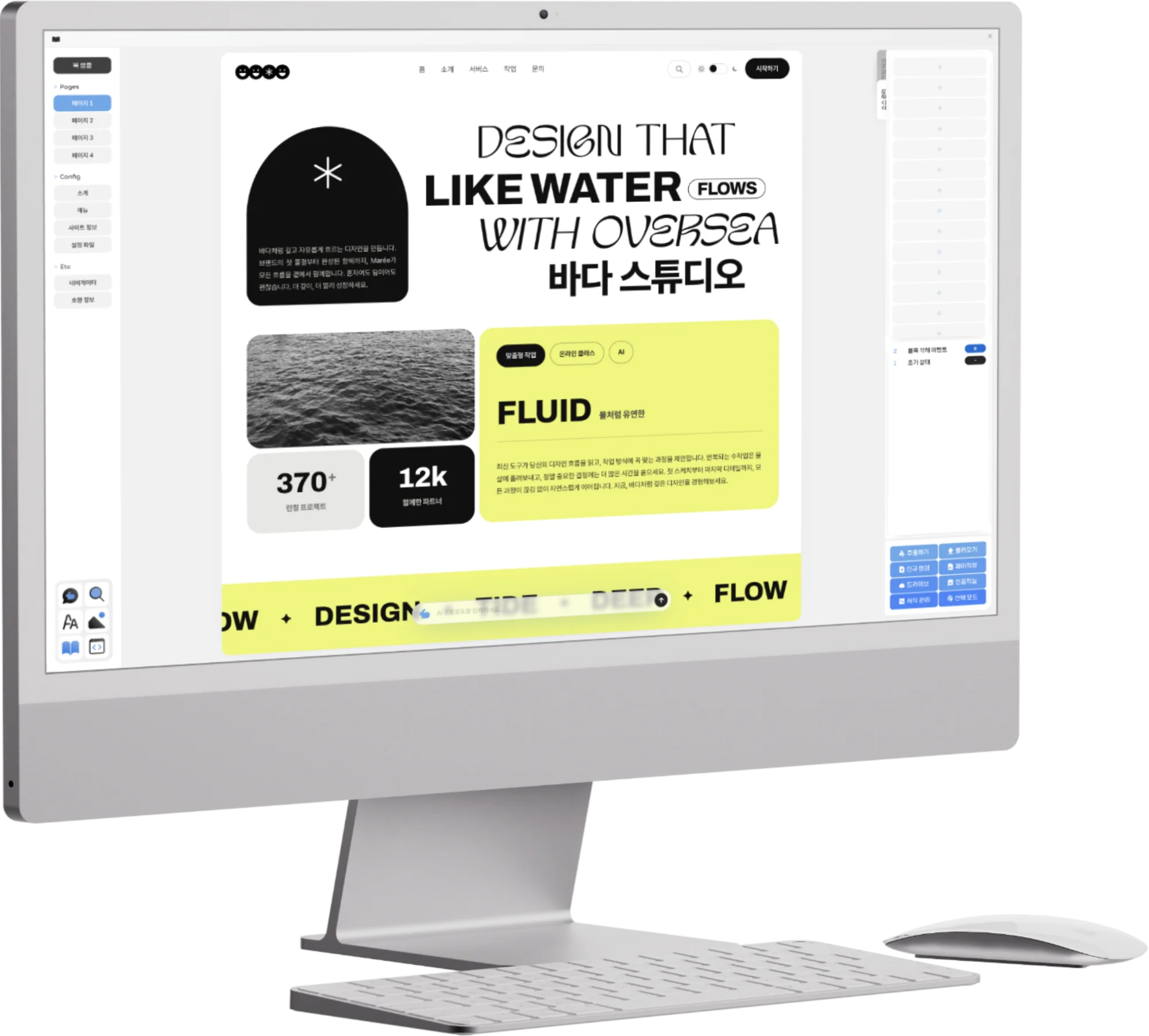
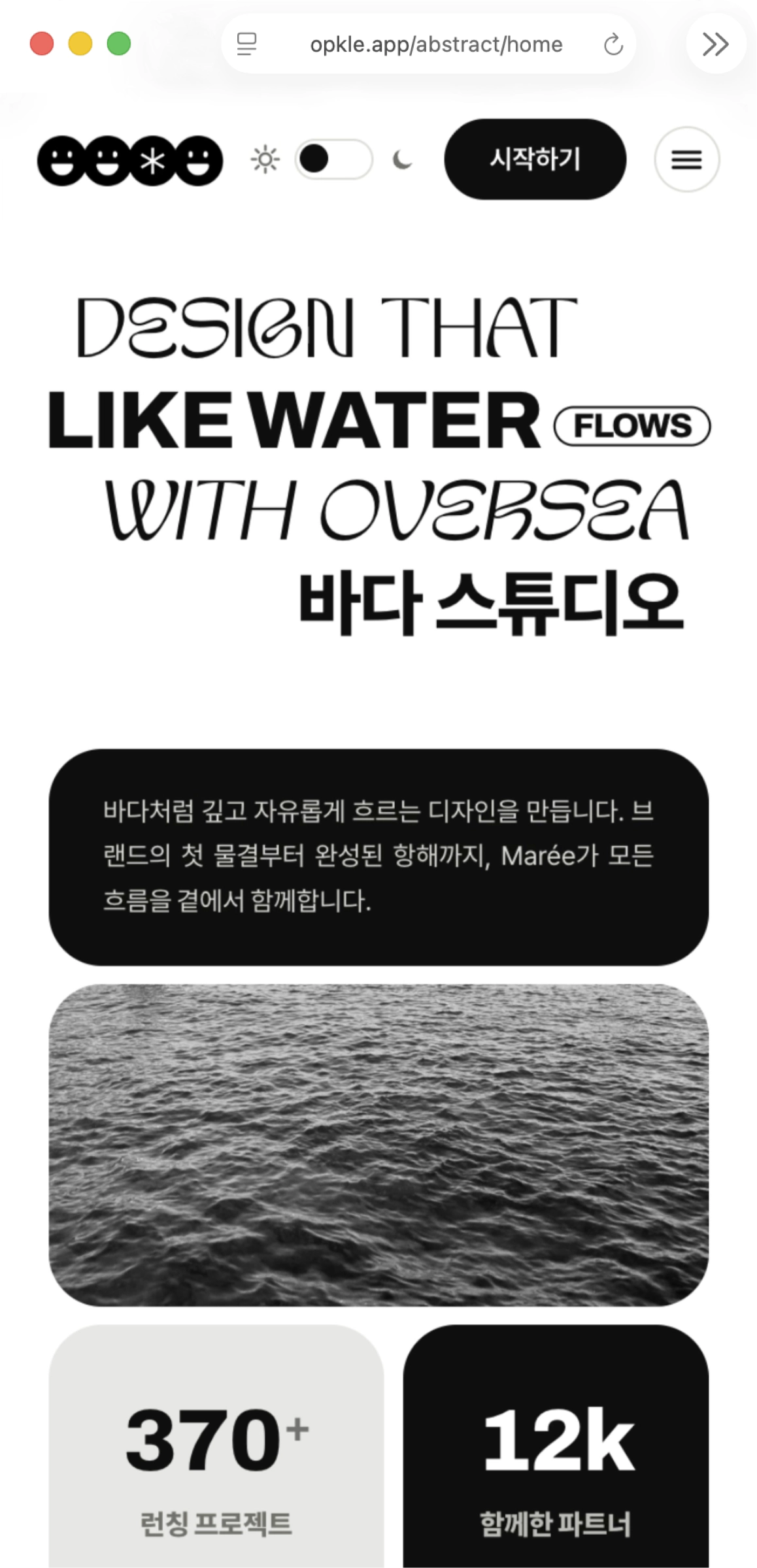
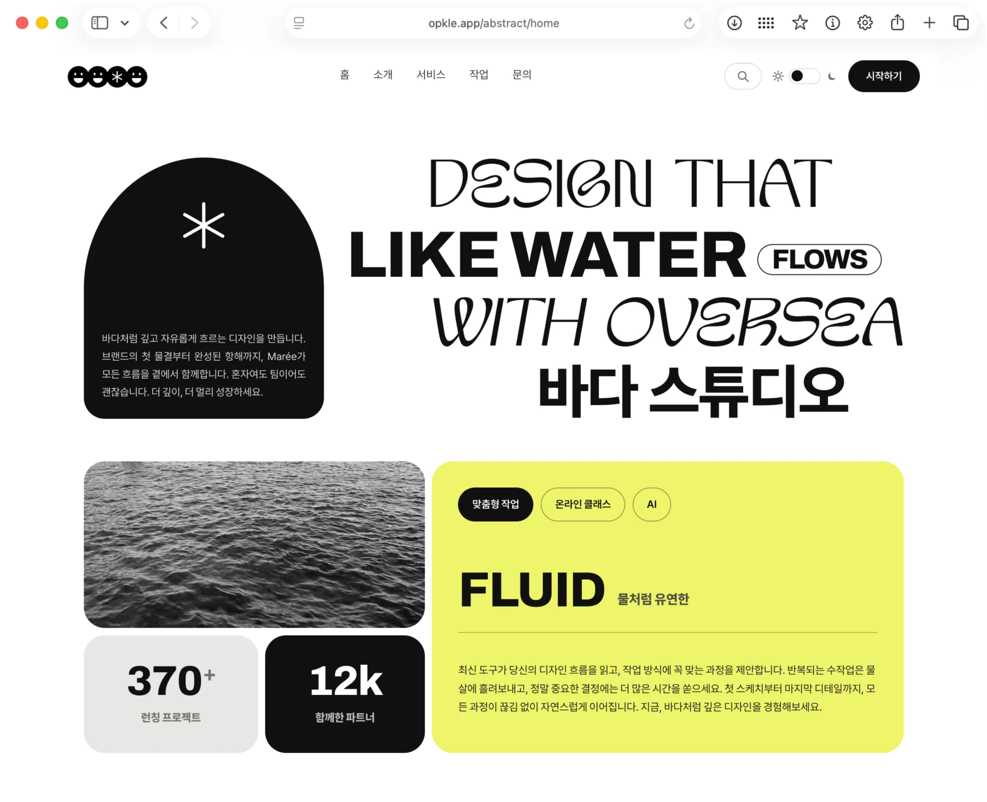
Once the structure for synchronizing several Shadow DOM previews at once was in place, the next possibility was immediately visible. This editor didn't need to stop at simply showing an EPUB in advance. It could instead pull media query support, which matters so much in EPUB3, into the editing process itself. It could become an editor where you edit one document while watching mobile, tablet and desktop screens together, and check different layouts and images under each screen condition.
In EPUB, media queries are not an extra. Readers may read on a phone-sized screen, on a tablet or e-reader, and may switch between light mode and dark mode depending on the app's settings. For an ordinary web page you can review against a few browser viewports, but EPUB is affected much more by the reading system's environment and the reader's settings. So the editor had to be not a tool for checking whether a book looks good on a single screen, but a tool for checking how the book's structure holds up under many reading conditions.
I framed this structure along two axes: a viewport axis of mobile, tablet and desktop, and a color scheme axis of light mode and dark mode. That effectively yields six main preview targets: mobile light, mobile dark, tablet light, tablet dark, desktop light and desktop dark. Each Shadow DOM looks at the same document state but renders under different media and color conditions. From then on, Opkle Editor was no longer a tool for editing only the body text but an editor that reviews and adjusts even the media query state in real time.
Preview Targets by Screen Size and Color Mode
The earlier preview began as a structure showing mobile and tablet at the same time. Adding a desktop preview makes three basic viewport axes. Each preview has its own shadowRoot and renders from the same XHTML and CSS state. But in real EPUB reading, light mode and dark mode matter as much as screen size. So I separated the color scheme out as its own axis.
I kept the structure simple. There is one document state and several preview targets. Each target has a viewport profile and a color profile. The viewport profile carries width and height conditions like mobile, tablet and desktop, and the color profile carries light or dark. When rendering, the same block tree is used, but the CSS context and root attributes injected into the shadowRoot differ. For example, if the preview root is given states like `data-view="mobile"` and `data-theme="dark"`, the CSS applies according to those conditions.
This makes the flow of editing events clean. Even if a user fixes a paragraph in the mobile dark preview, the source document state changes, and the result is projected again onto the other five preview targets. Conversely, if they change an image layout in desktop light, the same state is saved, and each target shows the result for its own conditions. There are six screens but one document.
The light/dark toggle also slotted naturally into this structure. Pressing the button couldn't just change the editor's UI theme; it also had to change the color condition of the EPUB body preview. I needed to be able to see right away how the background, text color, link color, image contrast and table line color look in dark mode. The toggle was not a UI convenience but a device for switching the actual reading conditions of the EPUB.
Light Mode and Dark Mode
If you manage dark mode like a separate document, it gets complicated fast. You can't end up with a light XHTML and a dark XHTML for the same body text. An EPUB should keep one body structure and let the presentation change according to CSS conditions. So I handled light and dark not by duplicating the HTML but through a combination of CSS state, media queries and a theme attribute.
The key was to keep the body structure and change only the presentation layer. I wrote CSS that responds to `prefers-color-scheme`, and in the editor preview I put in an explicit theme state so light and dark could be forced. In a reading system it can follow the user's settings, and inside the editor you can check each mode directly with a button. That way the CSS that goes into the real EPUB and the editor preview run on the same principle.
Changing only colors wasn't enough. In dark mode, image brightness and contrast, table borders, highlight backgrounds, link colors and the gray levels of captions can all differ. Images in a book especially may look fine on a light background but appear to float on a dark one, or get lost in it. So images and tables had to respond to media and theme conditions more actively than ordinary paragraphs.
Once the structure was in place, reviewing became far clearer. You no longer have to look only at mobile light on one screen and judge “looks fine.” The same paragraph and the same image appear under six conditions at once, and every condition updates the instant you edit. EPUB media queries were no longer something written only in code; they became something you see and adjust directly inside the editor.
A Component That Carries Six Conditions Together
The most important part was images. In EPUB, an image doesn't end with a single `img src`. A vertically cropped image may suit mobile better, an image with margins may be good for tablet, and a wider aspect ratio may be needed for desktop. Add light and dark modes, and the same scene needs up to six image variants.
The solution was clear. Instead of seeing an image as a reference to one file, I could make it a component that carries several variants together. An image block can internally hold resource references for mobile light, mobile dark, tablet light, tablet dark, desktop light and desktop dark. If images go into this component structure from the moment the user adds or creates them, you never have to bolt on media query support awkwardly later.
In the XHTML this component looks like a single image block, but its internal state holds several resource paths. CSS decides which variant to show depending on viewport and theme conditions. Depending on the situation, the implementation can go the `picture/source` route, or a combination of CSS background and class, and inside the editor it can pick the resource that fits the current target through a data attribute. What mattered was that behind the user's action of “adding one image” there is an image model holding multiple reading conditions.
The OPF manifest also had to be updated to match this structure. With six variants, all six resources must be included in the package, with each media-type and path registered accurately. When an image is generated or replaced, the component state, resource store, manifest state and preview DOM all change together. Because of the synchronization structure I built in Part 3, this flow followed naturally.
This approach was very solid. A user can swap the mobile dark image while keeping a different image in desktop light. The editor shows the correct variant in each preview target, and on save it preserves the component state and the manifest together. As long as the media query CSS is written thoroughly, the same principle holds inside the EPUB too.
Image Generation Built Around Components Too
Once the image component became the standard, image generation itself had to change as well. Making a single image and dropping it into the body, as before, isn't enough for a responsive EPUB. You have to know from the start under what conditions this image will be used. You have to think together about the aspect ratio needed on mobile, the margins needed on tablet, the resolution needed on desktop and the contrast needed in dark mode.
So I designed the image generation flow around component state as well. When a user creates one image block, that block isn't a single file but a variant container. After that, they can generate or replace an image for each condition and check it right away while watching the preview targets. If an image is too bright in the mobile dark preview, they can replace only that variant and leave the desktop light preview alone.
This structure is good for creators and good for the EPUB package. Creators can adjust while seeing directly “which image shows on which screen,” and internally every variant is managed as an explicit resource. At export time, it is also easy to trace which image is used where. To avoid missing manifest entries or wrong references, everything from component state to OPF registration can be tied into a single flow.
As a result, images became a much more active unit of expression within the EPUB. Instead of a single image being forced to fit every screen, the structure can show different images depending on the reading environment. This was an important point where Opkle Editor brought the strengths of EPUB3 into the real production experience.
Flex Layout and Responsive Structure
Tables were an important problem too. In EPUB, tables often fall apart on small screens. On desktop or tablet a side-by-side horizontal structure is natural, but on mobile the same structure gets too narrow, the text shrinks, or it can create horizontal scrolling. If you use ordinary HTML tables as they are, presentation can also vary widely between reading systems.
So it was more stable to handle tables and table-like layouts as flex-based components. On desktop and tablet, `flex-direction: row` places the cells or columns side by side, and on mobile `flex-direction: column` creates a vertical flow. The information structure stays the same, and only the arrangement changes with the reading conditions. This approach also fit EPUB's reflowable reading well.
What mattered was not to turn a table into merely a “nice-looking box.” Internally it had to keep the meaning of rows, columns and cells, and in the preview it had to be editable like a block. When a user views the table in the mobile preview, each item follows the next calmly in a vertical line, and on tablet or desktop they sit side by side for easy comparison. CSS media queries change only the presentation of this structure.
This table component ran on the same principle as images. The document state holds the information structure, the CSS state holds the per-viewport placement rules, and the preview targets render that combination. When the user edits the table's content, it is reflected in all previews, and when they change a layout option, the CSS rule is updated. The switch between `row` and `column` looks like a simple style change, but it was actually the key device for supporting small screens reliably in EPUB.
Media Queries as a Hands-On Editing Experience
At this stage Opkle Editor moved away from the approach where a developer writes media queries in code and checks them afterward. Mobile, tablet and desktop previews are visible at once, light and dark modes switch with a button, and image and table components respond to each condition. Users edit while watching the result, and the editor reflects that result consistently in the XHTML, CSS, resource store, OPF manifest and IndexedDB.
Technically, the key was dividing the state axes well. The document state handles the semantic structure of the body text. The media state handles viewport conditions. The theme state handles light and dark modes. The resource state handles image and font variants. CSS serialization turns these states into rules that can be reproduced inside the EPUB. Each Shadow DOM preview is the rendered result of a combination of these states.
Organized this way, the system becomes very robust. Whichever preview you edit in, the source is one, and whichever mode you view in, each condition is clear. Even if an image changes in mobile dark, desktop light doesn't wobble, and even if you change the table's mobile column layout, the tablet row layout keeps its own rules. At the same time, all the resources and CSS go into an exportable EPUB structure.
As a result, media query support came together with real polish. I could edit while reviewing the combinations of mobile, tablet and desktop with light and dark at once, and image variants and flex-based table layouts also ran reliably inside the EPUB package. In repeated reviews, the preview, CSS, manifest and IndexedDB saved state matched up consistently. From then on, Opkle Editor was no longer simply a tool for making EPUBs but a system where you can actually edit the responsive expressiveness of EPUB3.
© Abstract Cloud. All Rights Reserved.
+82 10-2747-3403
are copyrighted by Opkle.