



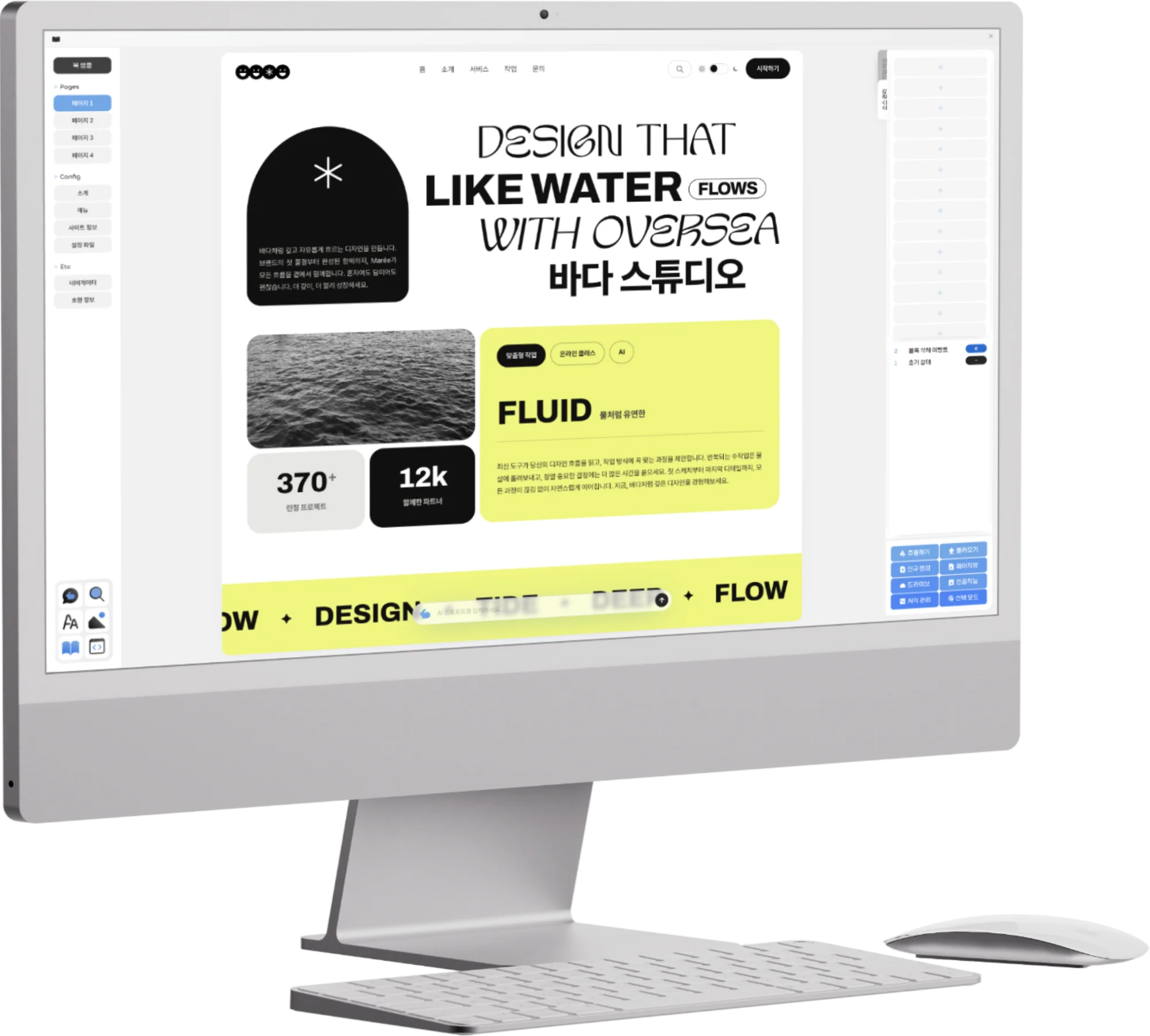
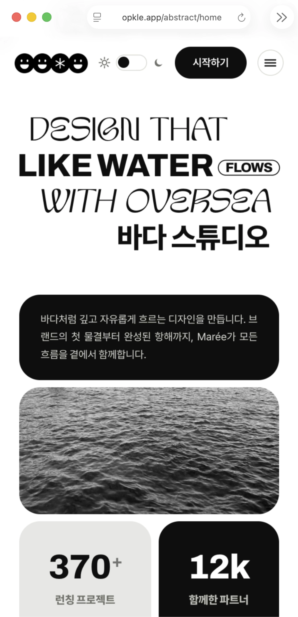
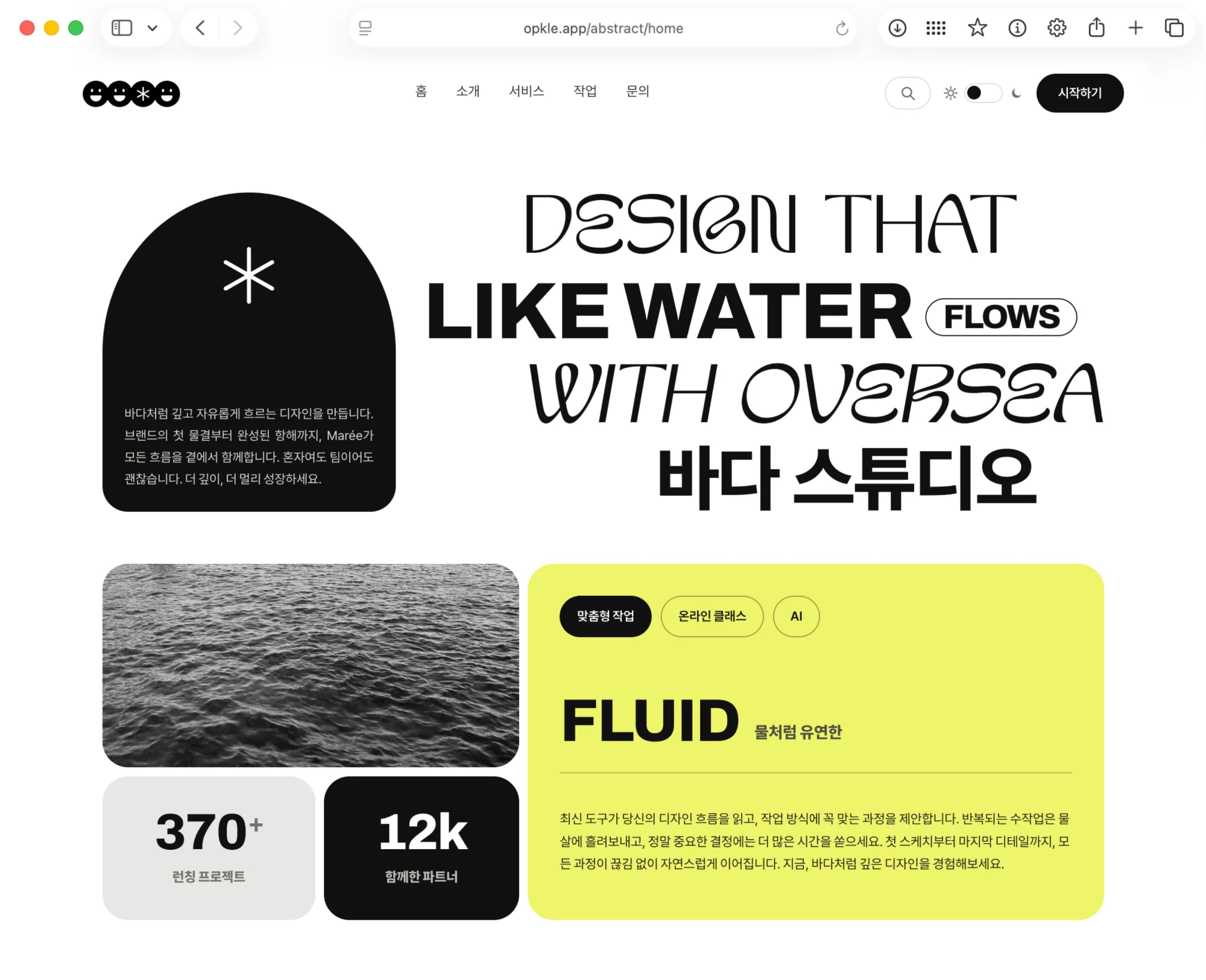

An ebook read on a phone and an ebook read on a big computer screen show the same text, but they don’t need to look the same. On a small screen, long sentences shouldn’t feel too crowded, and on a wide screen a line shouldn’t grow so long that the eye loses its way. When reading at night on a dark screen, it is better to have a color relationship that is easy on the eyes than to keep black type on a bright background. A good ebook doesn’t force one scene on every reader; it finds its place again according to the reading environment.
CSS lets you make rules that respond to these changes. You can prepare different margins and image layouts for narrow and wide screens, and set different colors for text and background on bright and dark screens. If HTML tells us which text is a title and which is body, CSS looks at how comfortably that text should read in the environment the reader is in right now.
In this article, we look in turn at how CSS changes a document to fit the screen size, how it handles color in light mode and dark mode, and why this flexibility matters for ebooks.
1.Find out why the same document needs different layouts on a phone and a computer.
2.Understand how CSS looks at the width of the screen and applies rules to match.
3.See how the relationship between text and background is prepared differently for bright and dark screens.
4.Sum up what it means for an ebook to accept the reader’s device, type size and reading settings.
Even the Same Document Reads Differently When the Screen Changes
If you put a page made for a wide computer screen into a small phone screen as it is, the text shrinks, buttons and images crowd together, and a line of text can break up awkwardly. Conversely, if you put a narrow paragraph made for a phone onto a big screen as it is, the margins can be too wide or the content can look pushed to one side. The content of the document is the same, but because the vessel in which the reader meets it has changed, the reading experience changes too.
In ebooks, this difference shows up even more often. One person reads the same EPUB on a small smartphone, another on a 10-inch tablet, and another in a wide computer window. You can’t make the book in three separate kinds. Instead, a single book has to accept the screen size, and the titles, body text, images and margins have to be rearranged appropriately within it.
For example, on a small screen you can reduce the margins around the body a little so the text doesn’t get too narrow. On a wide screen you can keep a comfortable width so a paragraph doesn’t run too long on one line. Where two images sat side by side, showing them one above the other on a narrow screen lets you deliver the content comfortably without forcing the images smaller.
This is not giving up on design. It is looking after the same book so that it keeps the same intent on different screens. A title must show clearly as a title everywhere, the body must be comfortable to read on any screen, and images must not cover the text. Instead of one fixed picture, CSS prepares rules that keep the book a book across many screens.
Reading That Changes with Screen Size
Small and large screens may hold the same text, but the paragraph width and margins that are comfortable to read differ.
Since one ebook file opens on many devices, it must be able to rearrange itself according to the screen size.
On narrow screens, keep text from getting too narrow or images too small, and on wide screens keep sentences from running too long.
The goal is not to make every screen identical but to keep the flow of the book on any screen.
CSS Applies Different Rules Depending on the Width of the Screen
CSS has ways of looking at conditions such as the width and height of the screen the document sits on and its aspect ratio. You can prepare it to use one set of rules when the screen is at least a certain width and another set when it is narrower.1 What matters is not memorizing device names like phone or computer. It is looking at whether the space the document actually sits in is wide or narrow, and choosing the look that reads well in that space.
The principle resembles choosing clothes. Just as the same person wears different clothes in summer and winter, the same document can have different margins and layouts on a narrow screen and a wide one. On a small screen you can trim the space under a title, let an image fill a whole line, and spread out content that sat side by side into a vertical stack. On a wide screen you can give more room to breathe between an image and its explanation, or refine things so the content doesn’t lean too far to one side.
Because CSS can prepare rules according to conditions like this, you don’t have to rewrite the structure of the manuscript. A title in the HTML is still a title and the body is still the body. What changes is the space those elements take on the current screen and the distance between them. You keep the content as one book and adjust only how it looks to read, to suit the environment.
This approach is especially useful in ebooks. When a reader turns the screen from portrait to landscape, the book can use the newly widened space. Even if you shrink the window or change the e-reader’s margin settings, the body can find its place without pushing images off the screen. CSS is less a magic that senses screen size and more a language that pulls out reading rules prepared in advance when a change occurs.
CSS That Changes to Fit the Screen
CSS can apply different rules depending on conditions such as the width and height of the space a document sits in.1
You can prepare text and image layouts that read well on one line for narrow screens, and more generous layouts for wide screens.
It leaves the title and body structure of the HTML alone and adjusts only the space and spacing those elements take.
Even when the screen is rotated or the window size changes, the book flows again into a form that reads well.
Light Mode and Dark Mode Mean Resetting the Relationship of Colors
The colors that read well on a bright screen differ from those that read well on a dark one. Dark text on a white background reads clearly in the daytime, but looking at it for long in a dark room with strong light can tire the eyes. Conversely, light text on a dark background can be comfortable at night, but if you bring over the colors made for a bright screen as they are, links or emphasized sentences may be hard to see, or the edges of images may vanish.
Dark mode is not simply flipping the background to black. It means looking again, together, at the contrast between text and background, the color of links, the borders of quotations and notice boxes, and even the margins around images. You have to check that the body text is readable enough, that emphasized sentences don’t blend into the background, and that pale gray explanations don’t get too faint. That is because colors are read within their relationships with one another.
CSS can prepare color rules differently depending on whether the user prefers a bright or a dark screen.2 A publisher can set the text, background and line colors for a bright environment and prepare their matching colors for a dark one as well. That way, when a reader chooses night reading on their device, the book’s important hierarchy and mood can carry over in a form that reads well, instead of simply being inverted.
In ebooks, though, reading apps sometimes offer their own dark mode. Some apps follow the colors the publisher set, and some change colors and backgrounds for the user’s comfort. So good ebook CSS should be prepared so that the contrast and structure of the text survive in any environment, rather than insisting on one particular color. Color is a tool for showing a book’s character, and also a matter of accessibility that lets readers read for a long time.
What to Keep in Mind for Dark Mode
Light mode and dark mode don’t just change the background color; they change the relationship among text, links, emphasis and borders together.
There must be enough contrast between text and background for long body text and small explanations to be read comfortably.
CSS can prepare different color rules for the bright or dark color environment the user prefers.2
Because an e-reader may apply its own color settings, publishers should design in a way that doesn’t get in the way of the reader’s comfort.
An Ebook Is a Book That Reflows to the Reader’s Settings
After a printed book is published, the page size and type size hardly change. If readers want to see larger type, they need a magnifying glass or brighter light. An ebook is different. Readers can enlarge the body type, change line spacing, adjust margins, and choose whichever is comfortable between a bright and a dark screen. An ebook is a format in which the book moves to suit the reader.
This flexibility is not a weakness of ebooks but one of their most important strengths. The e-reader recalculates line breaks and page breaks according to the screen size, the type size the user has chosen, and the reading environment.3 The same chapter may spread across many screens on a phone and fewer screens on a tablet. But if the relationship among titles, body text, lists and images is well organized and the CSS is flexible, the content and reading flow of the book are kept.
CSS designs the book not to resist this change but to accept it. Instead of fixing the width of the body with a single number, it leaves some room to move within the screen. It keeps images from being cropped by growing larger than the screen, and lets long titles wrap naturally to the next line even on small screens. When readers enlarge the type, paragraphs and lists don’t overlap, and important notices aren’t pushed off the screen.
Of course, not every e-reader shows every feature of CSS at the same level. The EPUB standard requires reading systems to present the content of an ebook visually through CSS, but real apps may change some of the publisher’s styles according to user settings.4 This is not only an inconvenience. It also means that readers who want larger type or high contrast can choose their own reading environment. Ebook design is less about one perfectly controlled scene and more about preparing principles that read well for different readers.
What an Ebook Adapts to the Reader
Ebook readers can choose reading settings that suit them, such as type size, line spacing, margins and screen color.
The e-reader rebuilds line breaks and page breaks to suit the screen size and the reader’s settings.3
CSS helps images, titles and paragraphs read without overlapping one another through such changes.
Because rendering may differ slightly from one e-reader to another, ebook design should value flexible principles over control.4
Good CSS Doesn’t Insist on One Screen
If a book that looks perfect on a computer screen is hard to read on a phone, and a design that is crisp only on a bright screen tires the eyes at night, it is hard to say the book is yet ready for every reader. The role of CSS is not to stuff and mount one screen but to make sure that the book’s important relationships remain when the screen changes. Titles must be clearer than the body, paragraphs must be neither too cramped nor too far apart, and images must find their place within the flow of the text.
This principle isn’t telling you to give up the character of your design. It means making a character that survives in any environment. Calm type and generous margins, clear images and restrained color can carry on in different forms on a small screen or a large one, in bright places or dark ones. Instead of making the same book anew many times, CSS gives the book ways to read well in many environments by itself.
What creators and publishers should do is not try to make every reader’s screen identical. It is to make sure that when readers choose settings that suit their own device and eyes, the meaning of the text and the mood of the book don’t collapse. When HTML keeps the roles of the text and CSS flexibly refines how it looks to read, an ebook can keep being read as one book across different screen sizes and times of day.
2: W3C, “CSS Color Adjustment Module Level 1”. CSS can adjust color rules to the bright or dark color environment the user prefers.
3: W3C, “EPUB 3 Overview”. EPUB reading systems usually rearrange lines and pages to suit environmental factors such as the screen size and the type size the user prefers.
4: W3C, “EPUB Reading Systems 3.3”. EPUB reading systems render content visually with CSS, and may change some of the publisher’s styles in response to user interaction.
Key Takeaways
CSS can apply different margins and image layouts on narrow and wide screens to make the same document read well.
On bright and dark screens, the contrast among text, background and links has to be prepared differently as a whole.
An ebook is a book that reflows to suit the reader’s screen size, type size and reading settings.
Good CSS keeps the publisher’s design while letting readers read comfortably in their own environment.
© Abstract Cloud. All Rights Reserved.
+82 10-2747-3403
are copyrighted by Opkle.