



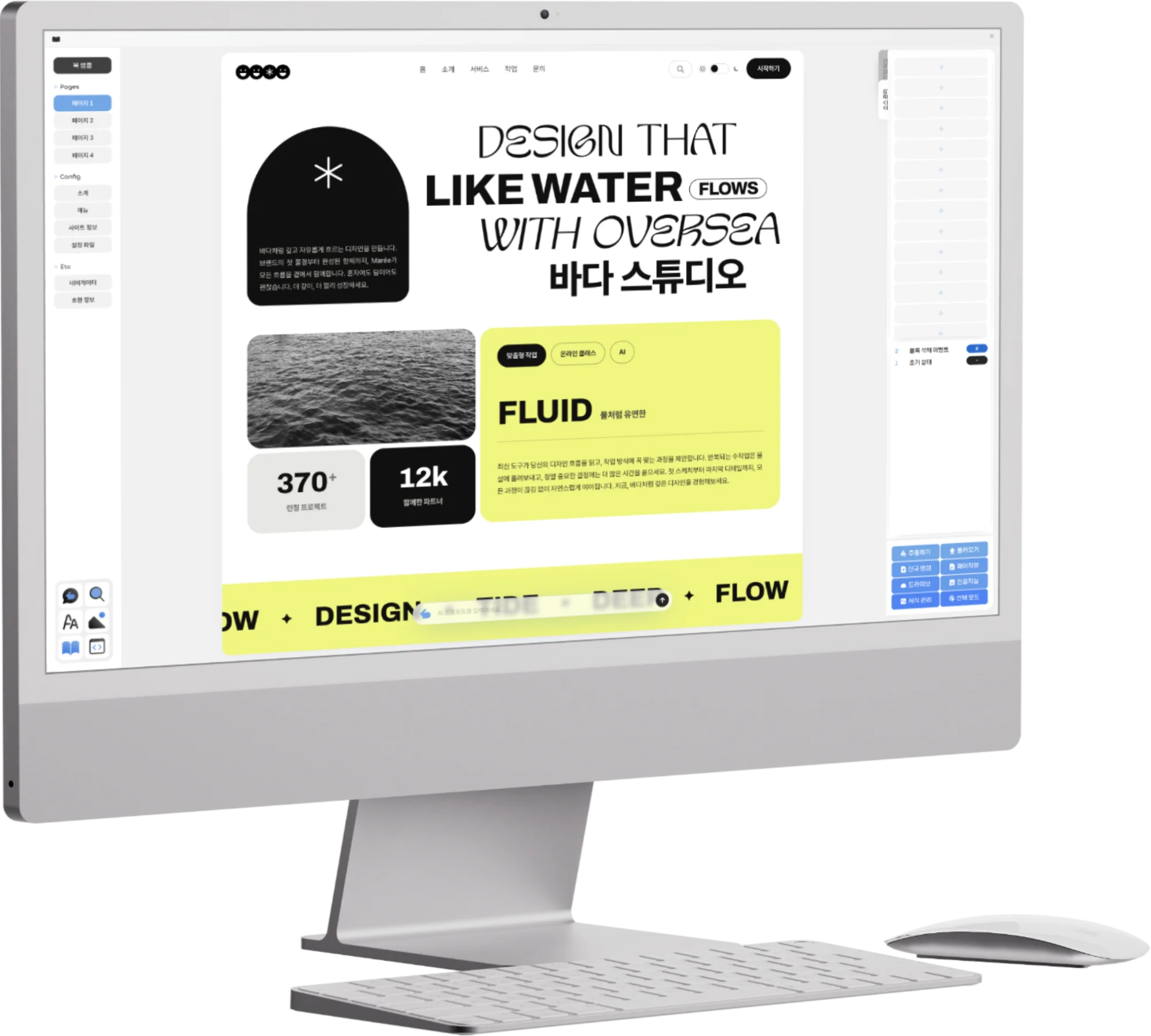
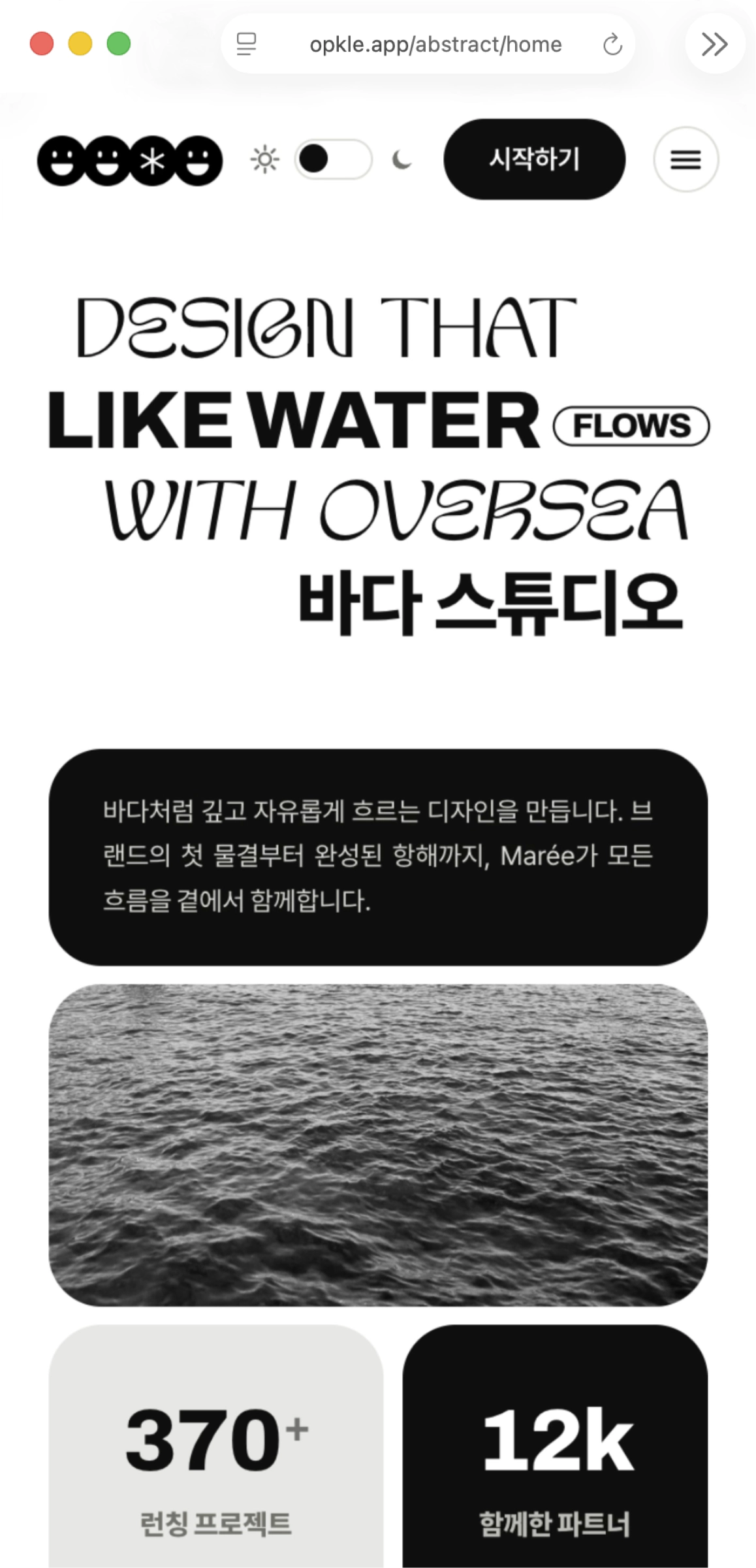



Writing one title and one paragraph in HTML does not mean those letters automatically get an exact place on the screen. The browser reads the document structure that HTML tags form, then thinks of each element as a box that can be placed on the screen. A title takes the place of one wide line, a paragraph beneath it lets text flow across several lines, and a link takes a small place within a sentence. CSS's box model is the basic principle by which an HTML tag unfolds into an element with real size, spacing and boundaries on the screen.
The word “box” misleads at first, because it brings only a square outline to mind. In CSS, a box is not necessarily a visible box. A line of text, a photo, a button and a paragraph each take up their own area on the screen. CSS decides how much content goes into that area, how much space to leave between the content and the edge, and how far to stay from other elements. Most of the alignment and breathing room we see on a web page comes from the relationships among these invisible boxes.
In this article, we look at how a tag turns into a box on the screen, what the four layers inside and outside a box each are, and why different tags, such as paragraphs and links, flow in different ways. Once you understand the box model, CSS's first riddles, like “I added spacing, so why did it get bigger?” and “Why does a paragraph drop to the next line?”, feel far less strange.
1.We learn how the browser reads an HTML tag as a box on the screen.
2.We look at what content, padding, border and margin do inside and outside a box.
3.We understand how width and spacing add up to the actual size on screen.
4.We sum up the difference between tags that flow like blocks and tags that stay inside a sentence.
The Browser Unfolds HTML's Tree into Boxes on the Screen
An HTML document has a structure in which tags sit inside one another. There is main inside body, article inside main, and the title and paragraphs placed inside that. After reading this structure, the browser calculates how to lay it out on the screen. The CSS standard describes this process as turning the tree structure of elements into a structure of boxes. The roles in HTML are, in a sense, translated into the places they will take on the screen.
For example, a p tag carries the meaning of a paragraph, and by default the browser unfolds this paragraph into a wide area distinct from the paragraphs before and after it. An a tag carries the meaning of a link, and usually takes up only as much room as its letters within a sentence. An img tag creates an area the size of the image. CSS adjusts the size and position of these boxes, along with their line breaks and alignment.
Not every tag becomes the same kind of box. Some elements use a whole line, some stay inside a sentence, and some can be made not to appear on the screen at all. But the first picture that helps a beginner most is this: each HTML element can be thought of as a box on the screen that has content and surrounding space. With this thought, you can understand CSS's rules of size, spacing and alignment as one whole.
The Flow from HTML to the Screen
HTML records the roles and relationships of content, such as titles, paragraphs and links.
The browser reads these roles and builds a structure of boxes to place on the screen.
CSS decides each box's size, position, spacing, border and layout.
Even without seeing the boxes directly, readers experience their result: the reading flow and the order of the screen.
A Box Is Made of Four Layers, from Content to Outer Spacing
You can think of a CSS box as having four layers from the inside out: content, padding, border and margin. The innermost content is the place where the actual contents sit, such as text, images and child elements. The padding around it is the inner spacing between the content and the border. The border is the line that makes the box's edge visible, and the margin is the outer spacing that keeps distance from other boxes.
Picture a gift box and it is easy to understand. The gift itself is the content, and the cushioning wrapped around the gift is the padding. The sturdy wall of the box is the border, and the empty spot on the desk that keeps the gift box apart from other boxes is the margin. Make the cushioning thicker and there is more room between the gift and the box wall, and widen the empty spot on the desk and the box moves farther from the others. Both look like spacing, but one is inside the box and the other is outside it.
A background color usually shows behind the content, padding and border, but the margin is transparent outer space. So when you make a colored notice box and the content looks pressed too close to the edge, you increase the padding, and if the notice box is too close to the next paragraph, you adjust the margin. Because the cramped feeling inside and the cramped feeling outside are different problems, a sense for telling padding from margin matters.
A Box from Inside to Outside
content: The central place where the actual contents, such as text and images, go.
padding: The inner spacing between the content and the border.
border: The line that reveals the box's edge.
margin: The outer spacing that keeps distance from other boxes.
Width Is Not Always the Same as the Total Width You See on Screen
The surprise you meet most often when first writing CSS is width. You write `width: 300px` on a box, but once you add padding and border, the width it takes up on screen can look larger than 300 pixels. This is because, in the basic calculation, width means the width of the content area. If there is 20 pixels of padding and 1 pixel of border on each side of the content, the visible box becomes wider than 300 by 20+20 and 1+1.
This calculation is not wrong. CSS thinks separately about the space the content can use, the cushioning space outside it, and the border. But it can look different from what you expect when you want to fit a box exactly within the page's width. In that case, using the promise `box-sizing: border-box` lets width be calculated with padding and border included. The number 300 pixels then becomes not the width of the content alone but the width of the box including its border.
You needn't fix every element's size with numbers from the start. On screens whose width changes, it is often more comfortable for a box to grow and shrink naturally to fit its parent area. The box model is less a formula for matching exact numbers than a map that helps you understand how much room an element actually takes. Knowing that width, padding, border and margin can add up to one another explains many scenes in layout.
Margin and Padding Are Not the Same “Spacing”
When paragraphs are pressed too close together and when the text inside a button is pressed too close to its edge, you must not fix them with the same spacing. Moving paragraphs apart is margin's job. Widening the gap between the text inside a button and the button's border is padding's job. One handles the relationship between elements, and the other the relationship between an element's content and its boundary.
For example, imagine making a colored card box. To let the title and body inside the card sit comfortably, you need padding. To keep the card well apart from other cards outside, you need margin. If you enlarge only the padding, the card itself grows and can feel cramped against other cards, and if you enlarge only the margin, the text inside the card can still sit pressed against the edge.
CSS can also set the spacing differently for top, right, bottom and left. Using one number gives the same value to all four directions, and using several numbers lets you give different values by direction. At first, though, rather than memorizing the order of the four directions, it is better to ask first, “Is this space inside the box or outside?” That answer tells you whether to choose padding or margin.
Questions to Ask When Choosing Spacing
Is the content pressed too close to the edge of the border or background? Think of padding.
Are two paragraphs, cards or buttons too close to each other? Think of margin.
Breathing room inside a colored box is made with padding.
Empty space between one box and another is made with margin.
Tags Can Flow Like Blocks or Stay Inside a Sentence
Another important thing in understanding boxes is how they flow on the screen. Tags that make large chunks of a document, like p, h1, div and section, by default often break lines before and after and use a wide area. You can think of these as elements that flow like blocks. The reading flow in which a paragraph comes under a title and the next paragraph comes under that paragraph arises from this.
On the other hand, tags that handle a part of a sentence, like a, strong, em and span, usually stay on one line together with the text. If putting in a link suddenly dropped the sentence to the next line, the reading flow would break. These take only as much room as they need within the sentence, and the next letters continue in the remaining space. An image can sit inside a sentence or be made to take a separate large area, depending on the situation.
CSS's `display` property is an important tool for deciding what kind of box an element makes in this flow. An HTML tag has its original role, but how it is laid out on the screen can be adjusted with CSS. Still, you must not forget a document's meaning just because something is easier to look at. The reasons for choosing p as a paragraph and button as an element that starts an action remain in the HTML, and it is better for CSS to handle how that element fits with its surroundings.
Boxes Give Way to One Another in the Normal Flow
When no special layout rule has been given, elements that flow like blocks are usually placed one after another from top to bottom. The title takes its place first, a paragraph follows beneath it, and the next paragraph is placed below again. You can think of this as the normal flow. The reason you can scroll and read a long text is also that the browser naturally connects the boxes within this normal flow.
On top of this flow, margin creates distance between boxes, padding protects the content inside each box, and border reveals the edge. CSS also offers other methods built on this normal flow, such as placing boxes side by side or arranging them in a grid. At first, though, you needn't try to solve everything with complicated layout tools. Just checking that titles, paragraphs and cards read naturally from top to bottom, and adjusting the spacing inside and outside the boxes, is enough to build a solid screen.
The box model is not a technique for making pretty borders, but the foundation that decides where a reader's eyes will rest and how they will move on next. If boxes are too crowded, the text feels stifled, and if they are too far apart, the relationships on a page loosen. The more clearly you tell apart the roles of content, inner spacing, border and outer spacing, the quieter yet clearer an order the screen gets.
The Box Model Translates HTML into a Screen That Is Good to Read
HTML tags record a document's structure and meaning. The CSS box model translates that structure into elements with size, position and spacing on the screen. Here, the box a tag makes does not end with its content. The padding as inner spacing, the border as the edge, and the margin as distance from other elements gather together to become the piece of screen readers will actually experience.
So when a layout doesn't turn out as you intended, it helps to ask, “What kind of box is this tag making?”, “Is the problem the space inside the box or outside it?” and “Should this element stay inside a sentence or start a new line?” The box model is not four words to memorize, but the most basic way of thinking that turns the meaning of HTML into a reading experience on the screen.
Key Takeaways
The browser reads the structure of HTML elements and unfolds it into boxes on the screen according to CSS.
A box has four layers, from inside to outside: content, padding, border and margin.
Padding is the spacing inside a box, and margin is the outer spacing between a box and other boxes.
Width can by default mean the content area, so padding and border can add to the actual size.
The difference between tags that flow like blocks and tags that stay inside a sentence creates the basic reading flow of a web document.
© Abstract Cloud. All Rights Reserved.
+82 10-2747-3403
are copyrighted by Opkle.